No wonder why colors are a vital part of marketing’s packaging for decades. Some colors make us feel relaxed and clam. Some colors unleash positivity. And certain colors have been associated with increased metabolism, eyestrain and blood pressure. Using them strategically can make your products look appealing to the customers.
According to one report, 60-90% of consumers judge the products on the base of the color. This is because color appeals quicker than text and graphics. Over 80% of customers admitted that color is a key factor when buying a product.
Color schemes eventually become a brand identity and are consistently maintained
Here we have outlined some colors and their impact on the mind.
Red:
Red is a powerful color that stimulates and excites. It can raise the nerve impulses as well as increase the heart rate.
Dark reds are perceived as professional and luxurious, while bright reds are more exciting and energetic and generally of lower perceived value than dark reds.
Orange:
Orange packaging suggests cost effectiveness, fun and adventure. There is almost a gamble involved in buying a product in orange packaging. It suggests something different, a journey, or an affordable price. In color psychology, orange means exploration, optimism, self-confidence and friendliness. It is passionate, extroverted and outgoing.
Yellow:
Yellow is quickly processed by the brain, making it a good one for grabbing attention. It is also an appetite stimulant and stands for happiness, optimism, and vibrancy. When you look at the color yellow, the brain releases a feel-good chemical known as Serotonin according to some studies. With its positive and happy energy it attracts children and young adolescents. Yellow packaging would be a great fit for products that aim to lift the spirits or bring joy.

Blue / Turquoise:

Reminiscent of the sea, turquoise signifies clarity of thought and communication. Calming to the emotions and restorative to the spirit, it can renew energy and inspire positive thought. Turquoise is a good color for health facilities and practitioners.
Green:

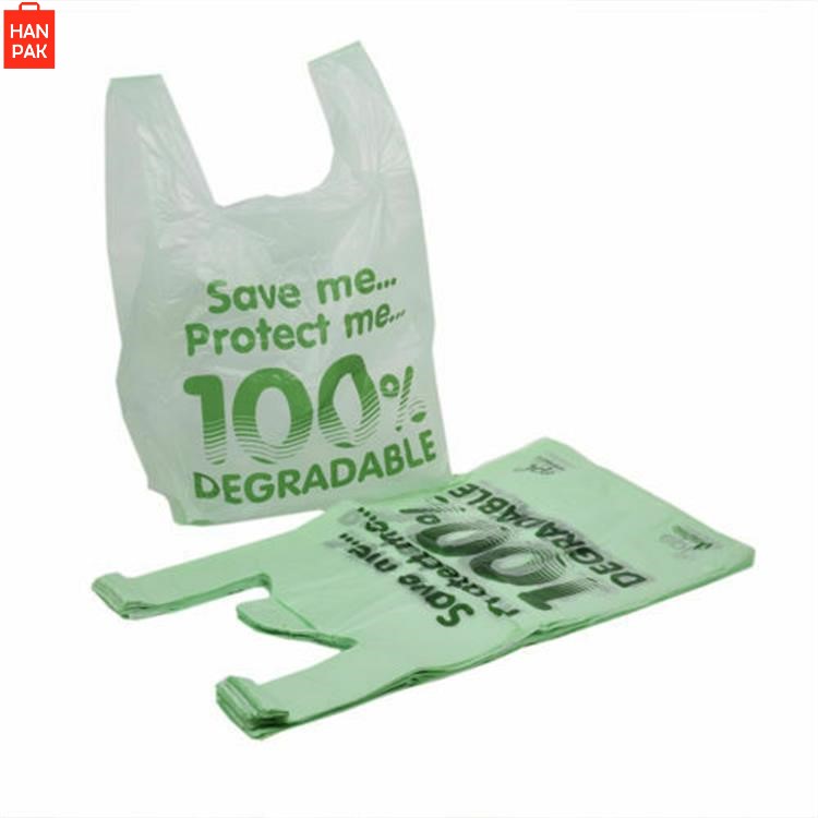
A color associated with balance and harmony, green is linked to health, wealth and growth. Always a great choice for nutraceuticals, eco-friendly or natural products. Green packaging is often an ideal color to choose, with the addition of decorative finishes or printing in colors that will attract your target market, it will prove even more effective.
Pink:
Pink packaging is calming and non-threatening. It is generally most appropriate for products relating to the female market such as cosmetics, fashion, beauty and romance because pink is inspirational, sincere, empathetic and soothing. Pink is feminine and youthful in its softer shades, with more passion and energy in its deeper shades.

White:
White stands for purity and simplicity. People think that the product doesn’t contain many ingredients when used in packaging. It is generally used for white color products such as yogurt, cream, milk, and cheese.
Black:
Black is a powerful color, signifying control and authority. When used as a packaging color, black tends to stand out and make products appear higher end and It evokes mystery and security.
Color schemes eventually become a brand identity and are consistently maintained,at Hanpak, we believe compelling packaging stimulates the consumer’s five senses. We help our clients capitalize on this by creating customized printing and color packaging solutions that “press the limits.”
CONTACT US here or reach info@hanpak.com.vn / +84 898 545 893 today, for more information or assistance.


